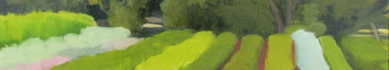
I worked on this square composition for a couple of hours today. I chose to work on this instead of the horizontal, thinking that I could work out some value and color decisions then apply them to the larger piece. I worked from several photographs I took yesterday. I felt both paintings were missing the feeling of cold and the weather issue which was so pervasive and therefore, to me, crucial in their success.
I decided to turn the palette cool, use more ultramarine and cool yellow (cad yellow light) for the greens. (I used sap green yesterday. Maybe that’s better as a summer green?) Also, I made the distant hills more violet than yesterday’s warm grey. That seems to be a good move. It looks like a colder day and I want that.
I am struggling a bit with a balance between shortening the value shifts (the difference between dark and light) to suggest the grey atmosphere versus losing the sense of distance by flattening the values. I found it helpful to check the landscape out my window while mixing colors, because showers continue to fall today. I certainly don’t have this view, but the colors and values are related. This painting is now closer to my impressions of the day, but I want to push it further, make it look wetter.


I love sap green too….nice perspective on the landscapes. You go girl! Fun to be with you guys the other night….Paul, thanks for the plants